Camera & Drone Gear Blog
Info, Reviews, Comparisons, & News
DJI Mavic 3 vs. DJI Air 2S - Image Quality Tests, Comparison and Review
Well it’s finally here… the DJI Mavic 3! This announcement was exciting (if you’re a camera nerd like me) because it is the first time I’m aware of that we have a compact, foldable drone with a 4/3 sensor (17.3mm x 13mm). This size sensor was previously only available on a Zenmuse X5, which requires an Inspire to use. Ever since the Phantom 4 Pro was released in 2016 any drones smaller than an Inspire maxed out with a 1” sensor (13.2mm x 8.8mm).
Having a larger sensor should mean less noise and more detail. So naturally I wondered… does the new DJI Mavic 3 beat my previous compact favorite, the DJI Air 2S?
Is the Mavic 3 the best drone camera from DJI short of buying an Inspire 2? I tested it out in a few locations and compared it to the DJI Air 2S.
This page contains links to products, so if you find this site useful and use a link to make a purchase, I’ll get a small commission. As an Amazon Associate I earn from qualifying purchases. Enjoy!
Well it’s finally here… the DJI Mavic 3! This announcement was exciting (if you’re a camera nerd like me) because it is the first time I’m aware of that we have a compact, foldable drone with a 4/3 sensor (17.3mm x 13mm). This size sensor was previously only available on a Zenmuse X5, which requires an Inspire to use. Ever since the Phantom 4 Pro was released in 2016 any drones smaller than an Inspire maxed out with a 1” sensor (13.2mm x 8.8mm).
Having a larger sensor should mean less noise and more detail. So naturally I wondered… does the new DJI Mavic 3 beat my previous compact favorite, the DJI Air 2S?
Before we dive into image quality tests vs. the DJI Air 2S (a.k.a. Mavic Air 2S), let’s take a look at how the specs compare.
DJI Mavic 3 vs. DJI Air 2S - Specs
Mavic Air 2S
1” 20MP Sensor (3x2 Ratio)
22mm Focal Length
5472×3648 Photo Resolution
5472×3078 @ 24/25/30 fps Video
Fixed f/2.8 Aperture
Weight = 595g
Flight Time = ~30 Minutes
Wind Resistance = ~24mph
Mavic 3
4/3 20MP Sensor (4x3 Ratio)
24mm Focal Length
5280×3956 Photo Resolution
5120×2700 @ 24/25/30/48/50 fps Video
f/2.8 - f/11 Adjustable Aperture
Weight = 895g
Flight Time = ~45 Minutes
Wind Resistance = ~27mph
Besides having a larger sensor, the other interesting thing about the Mavic 3 is that it features a gimbal with TWO cameras. The telephoto camera not mentioned in the specs above is a smaller sensor with a lower resolution that only produces JPG’s, so I will go over that camera with samples after I compare the Mavic 3’s main camera to the DJI Air 2S.
PLEASE NOTE: I am overly meticulous about image quality and I think both of these drones are great for a variety of purposes. I am going to be nitpicking slight differences in image quality just because it’s interesting (to me anyway!) to see how different sensors can affect the details of your photos.
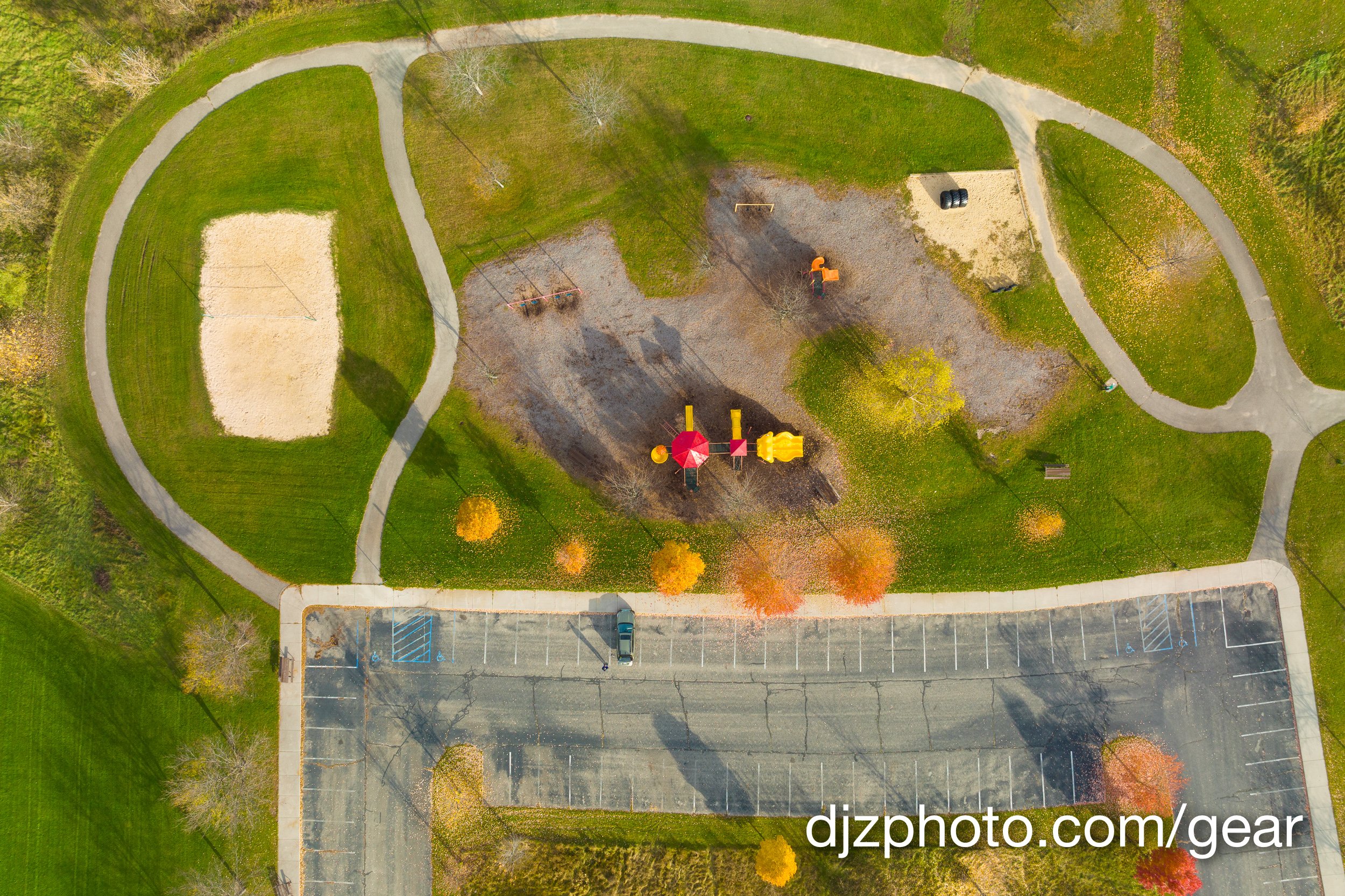
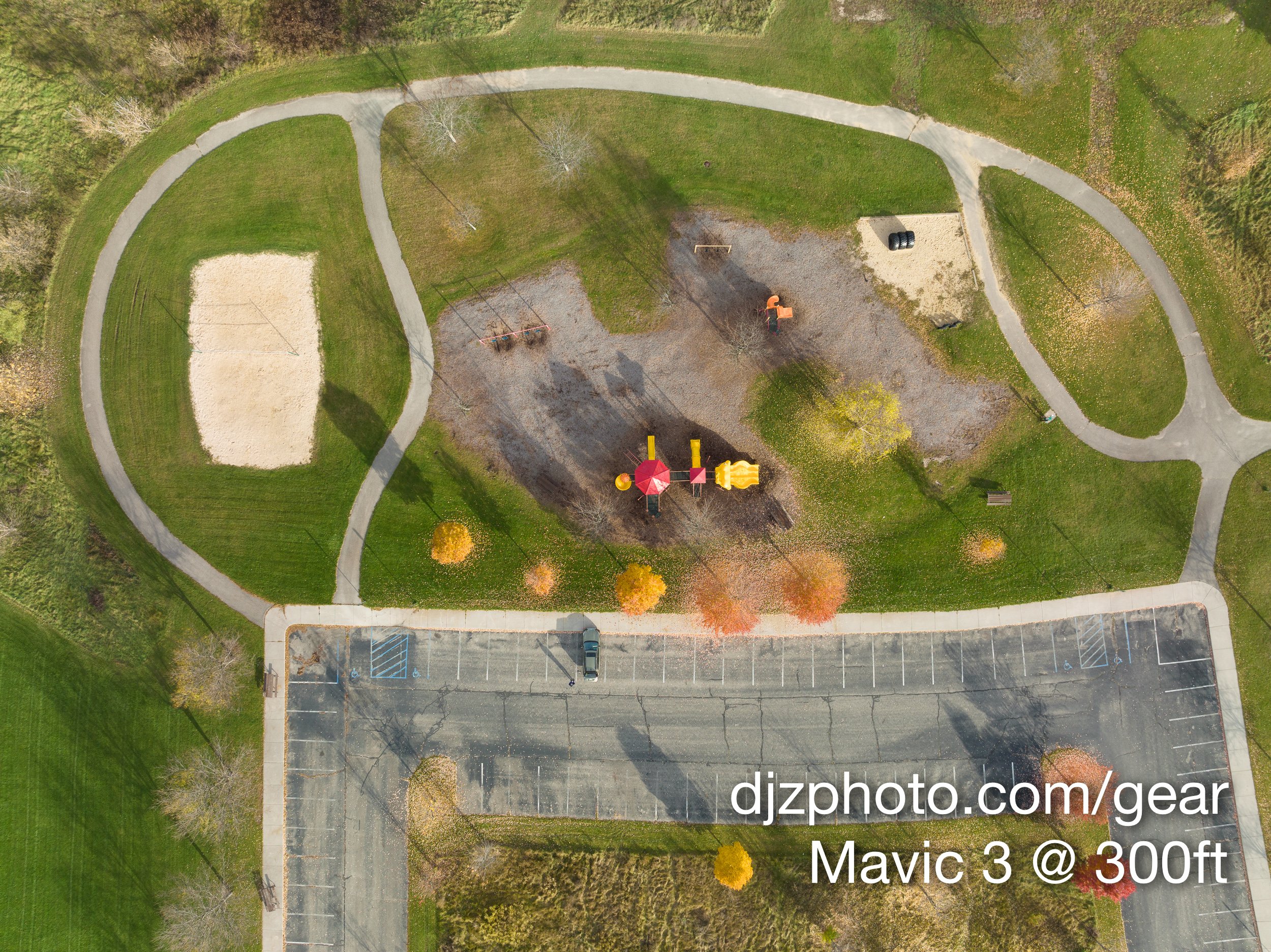
The first scene we will take a look at was a top down view of a park in the fall. Since the DJI Air 2S is 22mm and the Mavic 3 is 24mm, the Mavic 3 was at 300ft and the DJI Air 2S was at 275ft when these photos were taken in an attempt to make the comparison more similar. A perfect comparison was also difficult since the Mavic 3 is a 4:3 ratio camera and the Air 2S is 3:2 ratio.
Here are the overall images with no adjustments and default sharpening in Adobe Lightroom:
Looking at the above images you can see there is a bit of difference in color with no Lightroom adjustments and the white balance set to the default “daylight” settings. The DJI Air 2S seems a little on the red side, and there also seems to be more color in the Mavic 3 image straight out of the camera.
Let’s zoom in and compare some specific areas of the photos:
You can again see the color difference with these adjustment-free images. One of the things DJI promotes with the Mavic 3 is the “Hasselblad Natural Colour Solution” as a reason to consider paying the extra cost vs. the DJI Air 2S, and it looks like the Hasselblad sensor causes the color to “pop” a bit more. In the Mavic 3 image the red roofs are a cooler red and the ground is a warmer brown, which creates more color contrast for a more vibrant photo. The image from the DJI Air 2S seems a little bit more “drab” right out of the camera. You can certainly make colorful, compelling images with the Air 2S, but the Mavic 3 might have DNG files that start out with a slight advantage.
Even though I prefer the color of the Mavic 3, the DJI Air 2S definitely has a very sharp lens at the center and I’m impressed it was able to keep up with the larger camera on the Mavic 3 in the center of the frame. Both cameras are 20-megapixel and there’s not really much difference in detail.
Let’s see what happens if we venture a little farther away from the center of the lens:
In the above images we can start to see some differences in sharpness. When you look at this tree towards the edge of the frame you can see the photos taken at f/2.8 with both the Mavic 3 and DJI Air 2S are quite a bit softer than the Mavic 3 photo taken at f/5.6. The DJI Air 2S is always at f/2.8 because its aperture is not adjustable, whereas the Mavic 3 has an adjustable aperture. If you are taking photos in the daytime with the Mavic 3, you will almost always want to stop down and avoid using f/2.8 so you can maximize the edge to edge sharpness.
You can again see better color separation with the Mavic 3 over the DJI Air 2S. The colors are more vibrant and varied with the Mavic 3 and the DJI Air 2S almost seems more monochromatic.
Another notable difference in the tree crops is the DJI Air 2S is noisier in the shadow of the tree than in the Mavic 3 photo.
Let’s take a look at a scene with a lake. I tried to make these photos look fairly similar with global adjustment sliders in Adobe Lightroom, but an apples-to-apples comparison didn’t happen here because the sunlight was changing pretty quickly:
I took the above photos knowing the images would be different due to quickly changing lighting, but I wasn’t sure what differences I might find when I started looking closely on the computer. Let’s zoom in on some interesting differences I noticed in the shadows of the foreground:
Keep in mind that these are edited photos. I have saturation at +22 for the DJI Air 2S but just +18 for the Mavic 3. Looking at the above images, you can see the Mavic 3 managed to figure out all the various warm color variations of the leaves in the shadows and their color “pops” against the cooler green color of the grass. In the DJI Air 2S photo the leaves, grass, and trees all sort of blend together with a similar color. The Mavic 3 also managed to figure out the reddish-brown color in the edge of the woods under the trees on the left.
Let’s take a look at another area:
In the crops above it is apparent that there’s quite a bit more noise in the DJI Air 2S photo, which is a a close up of an area that was in the shadows. The Mavic 3 crop you can see individual waves on the water, but in the DJI Air 2S crop it’s a little too noisy to see the waves. You can also compare the brown-leaf tree on the right and the green tree on the left and see the Mavic 3 once again does better distinguishing the color differences of the brown and green leaves against the blue water. The DJI Air 2S crop (which is taken from towards the corner of the frame) is a bit softer than the Mavic 3 shot. The Mavic 3 shot is nice and sharp but shows a tiny bit of aberration on the white boat lift frame.
For my final test I took the drones indoors for a controlled test at ISO 1600 to see what the noise would look like. I used a chair with some crayons as a subject:
Both of these images are at f/2.8, ISO 1600, 1/8th shutter speed, with Vibrance & Saturation +/-0 in Adobe Lightroom. I did overcompensate the focal length difference and placed the Mavic 3 a little bit too far away (it was farther away than where the DJI Air 2S was placed), but we can still check out the noise difference when we zoom in on the crayons:
If you look at the top part of the wrapper of the yellow crayon, you can once again see the Mavic 3 creates better color separation with the orange mark on the yellow wrapper. The Mavic 3 sensor causes the orange mark to stand out as a different color than the wrapper, but the DJI Air 2S renders the orange mark as a similar color. You can also see that there is noticeably less noise on the red chair behind the crayons in the Mavic 3 crop vs. the DJI Air 2S crop.
Should you Buy the DJI Air 2S or the Mavic 3?
I have been using the DJI Air 2S extensively since it came out. It really is a great compact drone and the center of the lens is very sharp. There are a couple things I don’t like about it, however. The aperture is stuck at f/2.8, and if there’s one aperture setting I never imagined myself using to photograph sweeping landscapes it’s f/2.8 (haha)! Usually when I use my “big” camera to take landscape or architectural photos on a tripod I stay away from being “wide open” at the brightest aperture setting because that reduces my depth of field and can soften the edges of the frame, especially at wide focal lengths. With the DJI Air 2S your only choice of aperture is f/2.8. This also makes ND filters absolutely essential to control frame rates when shooting video.
One other thing I don’t like about the DJI Air 2S (and I’m really nitpicking here) is that the edges of the frame are not nearly as sharp as the center of the image, and this seems to be exacerbated by the fact that it is 22mm instead of 24mm. Objects at the edge of the frame are a little more distorted at 22mm than at 24mm.
Despite the aforementioned minor issues, overall the DJI Air 2S is great for a variety of purposes. It’s great for real estate, decent for landscapes, more than enough for hobbyists, and is a lot of fun. The reason I probably will be using the Mavic 3 for most landscapes is reduced noise, sharper frame edges, greater depth of field when stopping down to around f/5.6, and improved color rendition.
The basic Mavic 3 package is more than double the price of the DJI Air 2S. For that cost difference you get a little better image quality, an adjustable aperture, 50% more flight time, and slightly improved wind resistance. Due to the enormous difference in price the choice is certainly debatable, but if you’re serious about landscape photography and want more control over your photo & video settings the improvements might be worth the extra cost.
What’s Up with that Mavic 3 Telephoto Lens?
The gimbal on the Mavic 3 has two lenses and two sensors. The lower lens & sensor is the primary 24mm camera with the 4/3 sensor that produces JPEG & RAW images at 5280 × 3956. The upper camera is a 162mm fixed lens (7x optical zoom) with a 1/2-inch sensor that produces 4000 × 3000 images (RAW shooting only available if firmware is updated after May of 2022).
In order to use the telephoto camera you have to click the little binoculars icon on the right of the Go Fly app interface, which puts the camera into “Explore” mode. Once in explore mode you can click the “1x” button to see a variety of zoom levels all the way up to 28x.
One thing to be aware of is that most of the zoom levels are digital zoom, not optical. Both lenses on the Mavic 3 gimbal are prime lenses, not zoom lenses. Since there are two fixed focal length lenses, there’s really only two levels of detail you’re capturing. In “Explore” mode, 1x, 2x, and 4x are simply using a digitally zoomed (cropped) photo from the 24mm lens, and 7x, 14x, and 28x use the 162mm lens. To illustrate what this means, here are all the different zoom levels cropped into the yellow slide:
You can see a slight increase in detail going from “Explore Mode” 1x to 2x, but then 4x looks identical. I think there is an increase in detail going from 1x to 2x because at 1x it is using the 5280 × 3956 sensor to create a 4000 × 3000 image, which causes loss of detail (there’s less detail in 1x “Explore Mode” than in standard mode). The 7x, 14x, and 28x zoom levels all look pretty much identical.
If you’re not taking video, the only reason to use anything other than standard mode or 7x is If you want to use the different zoom levels to simply view your surroundings for fun (sort of like using flying binoculars). Many Mavic 3 pilots will find it fun to look around and zoom in on things in their vicinity from the air, and won’t be worrying about trying to print large photos with the lower resolution telephoto camera.
If you are creating a video, you can use the digital zoom functionality in Explore mode to add zoom effects to your video, but don’t expect to zoom in to 28x and capture super sharp details in your footage.
Mavic 3 Cine vs. Fly More Combo
Most of DJI’s recent drones offer “Fly More Combos” to purchase, which bundle the basic drone package with extra accessories like extra propellers, batteries, charging hubs, and other items at a slight discount to what you’d pay if you bought all the accessories separately. The basic drone package will get you flying, but if you buy the “Fly More Combos” you will be prepared for more frequent flights in a wider variety of situations. The Mavic 3 once again offers the “Fly More Combo,” but in addition you can instead buy the “Mavic 3 Premium Cine Combo.” You get the exact same aircraft whether you buy the base package or the “Fly More Combo,” but the “Mavic 3 Cine” is actually a special aircraft that includes 1TB of super fast internal storage and the capability to shoot videos in Apple ProRes 422 HQ.
Below are the different packages you can buy. For the “Fly More Combo” and the “Cine Premium Combo” I noted the difference between the combo and the standard package.
Mavic 3 Basic Package
Mavic 3 Fly More Combo
DJI Mavic 3 Cine Premium Combo
DJI on Amazon.com
This page contains links to products, so if you find this site useful and use a link to make a purchase, I’ll get a small commission. As an Amazon Associate I earn from qualifying purchases. Thanks!
DJI Air 2S Review: Has DJI Finally Created a Superior Successor to the Phantom 4 Pro??
DJI has released the “DJI Air 2S” as the latest drone in the Mavic series. It has the same size sensor and photo resolution as the Mavic 2 Pro and the Phantom 4 Pro with 4K video @ 60fps or 5.4K video @ 30fps. Has DJI finally released a travel-sized drone that can replace my 4-year-old Phantom 4 Pro???
Testing the image quality of the DJI Air 2S vs. the trusty old Phantom 4 Pro. Will the latest Mavic be my new go-to compact travel drone? Or should I clean the bug guts off the Phantom 4 Pro and keep using it for another year?
I have had a Phantom 4 Pro since February of 2017. It has been my go-to drone for real estate photography and video for a few years. But at some point I can’t help but wonder, “How long do these things last? Is DJI going to release a superior compact travel drone for me to upgrade to someday? Should I just fly this Phantom 4 Pro for years until a motor fails and it crashes in a field?”
Back when the Mavic 2 Pro came out in 2018 many people thought of that drone as the successor to the Phantom 4 Pro, but the Mavic 2 Pro could only do video at 4K @ 30fps, whereas the Phantom 4 Pro could do 4K @ 60fps. So the Mavic 2 Pro failed to be a totally superior successor, though it has been a popular model.
When the DJI Mavic Air 2 came out in 2020 with a 48-megapixel camera (better thought of as a 12MP quad bayer sensor) that could shoot 4K @ 60fps I had high hopes about that being my new compact travel drone, but knowing it had a smaller sensor than the Phantom 4 Pro I had my suspicions. Once I got ahold of one I pitted the Mavic Air 2 against the Phantom 4 Pro in a series of photo quality tests, and I generally preferred the image quality of the Phantom 4 Pro’s camera over the Mavic Air 2. So the Mavic Air 2 didn’t end up replacing my trusty old Phantom 4 Pro.
Now in April 2021 DJI has released the “DJI Air 2S” as the latest drone in the Mavic series. It has the same size sensor and photo resolution as the Mavic 2 Pro and the Phantom 4 Pro with 4K video @ 60fps or 5.4K video @ 30fps. Has DJI finally released a travel-sized drone that can replace my 4-year-old Phantom 4 Pro???
This page contains links to products, so if you find this site useful and use a link to make a purchase, I’ll get a small commission. As an Amazon Associate I earn from qualifying purchases. Enjoy!
Shortly after my DJI Air 2S arrived I took it along with my Phantom 4 Pro (P4P) to a couple locations to test out the cameras, because I enjoy meticulously analyzing photo quality (i.e. I’m a dork). The first location was a park. Here are some unedited photos looking straight down at about 393 feet AGL:
The first thing you may notice in the two photos above is that the DJI Air 2S appears to be zoomed out more than the Phantom 4 Pro, even though they are about the same altitude. This is expected because DJI lists the Air 2S as having a 22mm full-frame equivalent focal length, and lists the Phantom 4 Pro as having a 24mm full-frame equivalent focal length. The Mavic 2 Pro has a 28mm focal length. Obviously one focal length is not better than the other, it just depends on the situation.
The other thing I noticed but was NOT expecting is that with these unedited DNG(RAW) photos the Air 2S has better color and contrast than the Phantom 4 Pro right out of the camera. Chalk that up as a win for the DJI Air 2S!
Now let’s see if we can see a difference in sharpness when we zoom in on these photos.
When looking at these crops keep in mind that the DJI Air 2S camera and the Phantom 4 Pro are both about the same distance from the subject (the ground at the park park), but the Phantom is “zoomed in” to 24mm while the Air 2S is “zoomed out” to 22mm. This should be an advantage for the Phantom 4 Pro when comparing crops of the same sized area of the park. If you have two cameras with equal lens sharpness and sensor resolution both the same distance from the subject, but one is at 22mm and the other at 24mm, the camera at 24mm should capture more detail of the subject since it is zoomed in farther.
In the extreme crops of the lower left, middle, and lower right areas of the park photos, the DJI Air 2S crops are 513 x 341 and the Phantom 4 Pro crops are around 570 x 380 (one of them is 576 x 384) due to the variance in focal length between the two drones. If both cameras/lenses were equally sharp the Phantom 4 Pro should have no problem winning, because it is zoomed in farther and has about 23% more pixels covering each cropped comparison area.
With that in mind, can the Air 2S can still win?
Before we jump in I would just like to say it’s obvious that either drone can produce great photos for a variety of professional purposes and I am cropping these more than anyone should ever need to crop them for a real project. We are just going to be looking at the fine details with extreme closeups to see if there’s a noticeable difference.
Here is the first crop from the lower left corner of the main park images:
Surprisingly, despite the Air 2S crop being only (513x341) vs. the P4P crop being (576x384), there is actually more definition in the Air 2S crop. The branches over the white table are sharper and more defined and you can see the brick lines better.
Let’s take a look at an extreme closeup near the middle of the full images:
In this close up of the middle of the photos it’s hard to say which crop has more detail, which in itself is a win for the DJI Air 2S since it’s accomplishing a similar amount of detail with fewer pixels in the crop.
Now let’s take a look at another crop from the lower right corner of the full images:
In this crop you can see significant green and magenta fringing around the edges of the white crosswalk paint and along the edges of the cement in the (570x380) P4P crop, and the fringing is almost non-existent in the (513x341) Air 2S crop. You can also see more detail and less color fringing on the yellow/green crosswalk sign with the Air 2S. Adobe Lightroom was applying lens corrections to both images.
Just so I don’t base my entire test around one photo, let’s take a look at some photos in the city!
These photos were both taken from about the same altitude and location (though it looks like I may have been 5 or 10 feet higher with the DJI Air 2S), and you can again see the difference between the focal lengths of 22mm and 24mm. The DJI Air 2S had better color and contrast right out of the camera for the city scene as well:
Now let’s check out an extreme crop of the left side:
The biggest difference in these drones really shows up at the edges of photos, which is where many lenses show their weaknesses. The (513x341) Air 2S crop of the left side is much cleaner, sharper, and more defined than the (570x380) P4P crop. You can compare the building edges & windows in these crops to see how there’s fairly significant green/magenta fringing on the edge of the P4P lens that’s almost non-existent with the Air 2S.
One more crop from the right side:
There isn’t a ton of difference in this crop, but something that I noticed quickly is how it looks like both cameras ran into a bit of a moiré issue with the right side of that building where the lines were close together. I used a radial filter in Adobe Lightroom to correct the moiré, and here’s the updated comparison:
With the moiré not distracting from the side of the building it looks like the window lines where the moiré was are slightly more defined and less noisy in the (513x341) Air 2S crop than the (570x380) P4P crop. There also might be a little more color fringing and noise with the P4P, but other than that there’s not a huge difference.
I wanted to do one more test in a high dynamic range situation after sunset where the foreground was very dark. In order to take photos at the exact same time identical lighting in each shot I just set both drones on a table and took the photos at the exact same time. Here are the original unedited photos taken at ISO 100, f/2.8, 1/25th shutter speed:
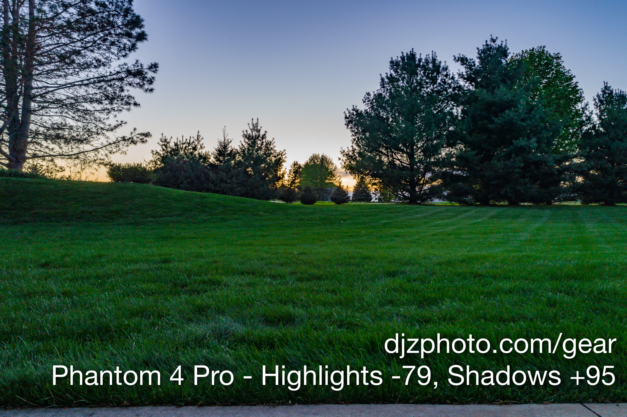
Here are the same photos with highlights reduced to -79 and shadows cranked to +95 in Adobe Lightroom:
And here are crops of the center of each photo:
If you compare the lower part of the tree trunk in the middle, the pine branches, and tree leaves, you can see how much sharper the Air 2S is right in the center of this high dynamic range scene.
Conclusion
The only thing I miss while using the included DJI Air 2S remote and the DJI Fly app is the ability to change camera settings with the wheel on the remote. With the remotes included with the Inspire 2 or Phantom 4 Pro you can press the right wheel to cycle through camera settings and then turn the wheel to change a setting in the DJI Go app. With the DJI Air 2S remote you have to tap on the screen and drag the slider to change values like shutter speed, ISO, or white balance.
Other than minor differences in the remote & app, after comparing the photo capability of the DJI Air 2S with my trusty Phantom 4 Pro in a variety of situations it is clear the Air 2S has a much sharper camera/lens combination. The sharper lens combined with the highest video resolution of any compact drone from DJI (i.e. smaller than an Inspire) has made the DJI Air 2S my new favorite travel drone.
If you found this article helpful and are planning on making a purchase, consider using one of the links on this page and I’ll get a small commission. Thanks!
DJI on Amazon
Canon EOS R5 vs 5D Mark IV: Canon has Upped their Game (And these Underexposed Photos)
When I switched from the 6D to the 5D Mark IV, I did notice a slight improvement in dynamic range and shadow handling. But this is a major advancement for Canon who had been previously been dabbling with small, incremental improvements here and there. Going from the EOS 5D Mark IV to the EOS R5 is not a small, incremental improvement… it’s like a whole new generation of technology.
I had been using a Canon EOS 5D Mark IV since 2017 and a Canon EOS 6D for a few years before that. I am very familiar with Canon’s limitations in terms of how far you can lift the shadows in scenes with a wide dynamic range and how much you can crank up the exposure if an image is underexposed. From night scenes to architectural interiors, it became second nature to understand how many exposures I would need to take at various shutter speeds in order to capture both highlights and shadows. The 5D Mark IV was a slight improvement over the 6D, but I had also become aware of how Sony’s sensors were better at handling shadows and high dynamic range scenes. Some Canon shooters were even starting to make the switch or contemplating the move. I had numerous Canon lenses, but I was seriously considering switching to Sony. It seemed like a pain to sell all my lenses and switch brands, but wouldn’t the sensor improvements be worth it?
Then Canon announced the R5.
Me: “OK, fine…I’ll at least try the R5 before I mess around with switching camera brands.”
So, has Canon improved their camera bodies’ ability to lift shadows and increase exposure with underexposed images? Is there going to be a noticeable difference compared to the 5D Mark IV?
Let’s take a look!
This page contains links to products, so if you find this site useful and use a link to make a purchase, I’ll get a small commission. As an Amazon Associate I earn from qualifying purchases. Thanks!
I decided to subject the Canon EOS 5D Mark IV and the Canon EOS R5 to a painful test… taking a photo at night and then cranking the exposure to +5 in Adobe Lightroom.
For the below comparison, I placed each camera on a tripod and used the exact same Canon EF 16-35 f/2.8L III lens (using the Canon Mount Adapter EF-EOS R with the R5) and took a picture of a lakeside deck at night. Both of these photos were taken after astronomical twilight and before moonrise, so the night was as dark as it was going to get.
Each photo was 8 seconds at 24mm, with an aperture of 7.1 and ISO set to 400.
And now it's time for the painful part. Let’s see what happens when we push these RAW images to Exposure +5 in Adobe Lightroom and reduce the Highlights to -100.
Wow! I was amazed when I saw the results. You can see the sky on the 5D Mark IV image has a greenish tint with purple bands going through it and lots of color noise, whereas the R5 somehow managed to pull what appears to be the correct colors in the sky with less color noise and no noticeable banding. Cranking the exposure to +5 on a night scene was clearly too great of a feat to pull off for the 5D Mark IV, but the R5 was able to handle it. We will take a look at some crops from this image a bit later, but first…
Random but Semi-Relevant Sidetrack
It’s pretty rare to have a legitimate reason to crank the exposure to +5, but the banding issue on the 5D Mark IV happened to me once when I was only at Exposure +2 while editing a real estate image in an unusual situation in 2018.
This is what it felt like to be in a dark basement with no electricity trying to produce a real estate image with my 5D Mark IV.
Is this a scene from Lord of the Rings in the mines of Moria? No…I was by myself shooting a foreclosed house with no electricity in the middle of nowhere, and I was in the pitch black basement with only a tiny window reminding me that daylight would once again shine on my face. Because I was in a hurry to get out of there before I woke the balrog, I did a run-’n-gun 12-image exposure bracket at ISO 400 that included a 30 second image. I also fired a separate speedlight shot at the window to control the hot spot. At a quick glance I thought the 30 second image would be enough to give me all the information I would need from the dark areas, but as you can see in the images below, I ended up with a horizontal green band that went across the center of the image and affected the shadows (shown just above the white line).
Canon 5D Mark IV, 30 seconds, ISO 400, f/7.1:
Here is a closer look at the green band from the 30 second exposure in two crops of the brightened RAW file (in the first crop image, the band only appears in the darkest areas on the left):
This situation was obviously extreme and unusual, and I basically made a mistake because I was in a hurry to get out of there. If I was being my normal meticulous self, I could have opened the aperture to f/4 or flipped the camera to bulb mode and done a 2-minute shot to make sure I had quality shadows. But this is one mistake I made that the R5 could probably handle, whereas the 5D Mark IV caused me to spend extra time in Photoshop fixing the green band. After blending multiple ambient exposures with my speedlight shot and muting the green band using Photoshop, here is the final image:
After blending multiple ambient exposures with a speedlight shot towards the window and fixing the green band, this was the final image.
Sidetrack Over - Back to the Night Scene
Back to the original night scene… here is a crop of the sky from each camera so we can see the difference close up.
You can see small banding/stripes with the 5D Mark IV in addition to the larger purple bands, but the R5 image is fairly smooth with better color and no noticeable banding, even in these crops. The sky in the 5D Mark IV image is essentially unusable. The R5 shows some noise as a result of raising the exposure to +5, but if you look at the whole image earlier in the article, it becomes apparent that you could make a mistake that significantly underexposes a photo but still end up with a usable photo with the R5. The R5 photo has some noise, but it is not catastrophic. This is a giant leap in performance over any of Canon’s previous photo camera bodies.
Here is another crop from the +5 exposure crank:
Again we see the 5D Mark IV pickup green in the deep shadows below the white board, but the R5 manages to have more detail, less noise, and better color.
Below is a crop of one of the hot spots, so we can see how the highlights are handled:
These hotspot areas are not very exciting to look at (in fact, it hurts my brain), but we can actually see that there is more detail around the edge of the hot spot in the R5 image. The R5 allows you to see the shape of the light spread more than the 5D Mark IV, and we can see more of the wood texture near the left edge of the highlight by the screw. Not very exciting, but it’s nice to see that highlight handling also appears to be slightly improved.
Another interesting observation is how much better the noise looks around the hotspot above the railing. The R5’s higher resolution sensor makes the noisy pixels smaller, which contributes to an overall smoother appearance.
Another Exposure Crank, Just for Fun
I did an architectural photoshoot recently that included twilight photos, and one of the cameras I had setup was the Canon EOS R5. Just for fun, I took an underexposed photo and cranked it to +4.35 in Adobe Lightroom. Here are the original and modified photos, along with what the final image looked like after blending multiple ambient exposures:
This is so much better than any of Canon’s previous camera bodies! Although I like the look of the final image better after spending time blending multiple exposures, look at how close to the final image I was able to come by simply cranking the exposure to +4.35 and dropping highlights to -100! The original photo makes you think no information was captured in the grass, trees, bushes, or other seemingly lost areas. But somehow the information is there, with a minor but acceptable noise penalty, and you can bring it out the completely dark areas with some simple sliders in Lightroom. Crazy!
Conclusion
I have produced tens of thousands of final images using the Canon EOS 6D and Canon EOS 5D Mark IV. When I switched from the 6D to the 5D Mark IV, I did notice a slight improvement in dynamic range and shadow handling. But this is a major advancement for Canon who had previously been dabbling with small, incremental improvements here and there. Going from the EOS 5D Mark IV to the EOS R5 is not a small, incremental improvement… it’s like a whole new generation of technology.
Other advantages the R5 has over the 5D Mark IV that I’ve found useful already:
50% increase in resolution (45-megapixels instead of 30)
“Focus Guide” for manual focusing, even if your lens doesn’t have AF (it allows you to place a focus point on your screen that indicates if a subject is in focus, focused too far to infinity, or too far towards close)
Exceptional Eye AF for people and animals
Access to all of Canon’s lenses, whether they are EF or RF mount (EF mount lenses require Canon’s EF to EOS R mount adapter)
If you’re debating the upgrade from a previous Canon camera body, I hope this article provided useful information. If you found this article helpful, feel free to use a product link from this page, and I’ll get a small commission. Thanks!
Products Mentioned in this Article
Canon EOS 6D (this link is to the 6D Mark II)
Megapixels vs. Sensor Size: Can the Mavic Air 2 Beat the Phantom 4 Pro?
I got ahold of a Mavic Air 2, and I just had to know how its higher resolution images compared to the 20 megapixel Phantom 4 Pro and its 13.2 x 8.8mm sensor. If the sensor sizes were the same, I would expect the sensor with more pixels to be the winner. But how do they compare when the higher resolution photos are from a much smaller sensor (6.4 x 4.8mm)? Let’s take a look.
See Also: DJI Drone Sensor Size Comparison Page
See Also: DJI Air 2S Review: Has DJI Finally Created a Superior Successor to the Phantom 4 Pro??
See Also: DJI Mavic 3 vs. DJI Air 2S - Image Quality Tests, Comparison and Review
See Also: Pelican 1400 Protector Case - A Customizable Waterproof Case for DJI Mavic Series Drones
( This page contains links to products, so if you find this site useful and use a link to make a purchase, I’ll get a small commission. As an Amazon Associate I earn from qualifying purchases. Thanks!)
When DJI announced the Mavic Air 2, I was a bit surprised at its max photo resolution of 8000x6000. Why, that’s 48 megapixels from a 6.4 x 4.8mm sensor! Considering all their more expensive drones with larger sensors produce images around 20 megapixels, what is going on with the camera on this new little drone?
I have had a Phantom 4 Pro for a few years, and they haven’t really released a sub-$2,000 drone with a better camera (as of July 2020). The Mavic 2 Pro is the closest to the Phantom 4 Pro with the same sensor size and photo resolution (though it is 28mm instead of the Phantom 4 Pro’s 24mm), but the Phantom 4 Pro from November 2016 still has better video specs than the Mavic 2 Pro.
2021 Update: DJI has now released the DJI Air 2S (also known as the Mavic Air 2S) which is a MUCH better drone than the Mavic Air 2. See my other article that tests the image quality of the DJI Air 2S vs. the Phantom 4 Pro.
I got ahold of a Mavic Air 2, and I just had to know how its higher resolution images compared to the 20 megapixel Phantom 4 Pro and its 13.2 x 8.8mm sensor. If the sensor sizes were the same, I would expect the sensor with more pixels to be the winner. But how do they compare when the higher resolution photos are from a much smaller sensor? Let’s take a look.
For the first shot, I took both drones to a lake:
The first thing I noticed is the Mavic Air 2’s max resolution is a 4x3 ratio (like a smartphone), whereas the more expensive drones (and most professional cameras) have a 3x2 ratio.
Both images seem great overall, so let’s take a closer look. For the first crop, I zoomed way in to the house on the little pointe in the upper left corner of the main shot:
The first thing I notice when comparing these two crops is that the Phantom 4 Pro seems to produce a much “cleaner” image with less random noise overall. The Mavic Air 2’s noise has the effect of making the image look like it was painted onto a rough texture when we are zoomed in extremely far. The Phantom 4 Pro (P4P) handles the trees with more sharpness and clarity, and produces less noise on the water. The brown house looks sharper and cleaner on the P4P with a sharper, cleaner, more defined shape.
One area I might give a win to the Mavic Air 2 (MA2) would be the shape of the boats to the right of the house. The MA2 picked up the shape of the boats better than the P4P, though there is a bit of noticeable color fringing.
The next crop is the closer house in the middle of the main images:
Again we can see the P4P produces a cleaner image overall. The window lines are more clearly defined and less noisy, the trees are more natural looking and defined, and the shingles on the roof look more natural and defined.
It is interesting to look at the MA2’s effect on the roof shingles at this extreme level of zoom… it’s almost as if the roof shingles have completely changed into an entirely different pattern.
That’s not to say the MA2 lost in every way… I think it did a better job of defining the curved line where the grass meets the cement, and a nicer job with the curved steps on the back patio area. I also think the MA2 did a better job defining the patio furniture in the upper left corner of this crop, and some of the roof lines seem sharper and more defined.
The last crop at the lake will be the boat, lift, and dock to the left of the houses in the middle of the main images:
In the above cropped images the P4P handles the tree leaves much better on the right. The MA2 turns the leaves into odd shapes that almost look like a painting. The P4P also did a better job with the water, as you can see the waves & ripples more clearly defined with less noise. The P4P also has less color fringing on the bright areas like the dock and raft.
The MA2 managed to define the shape of the blue boat lift canopy by the dock better, albeit with more noise than the P4P.
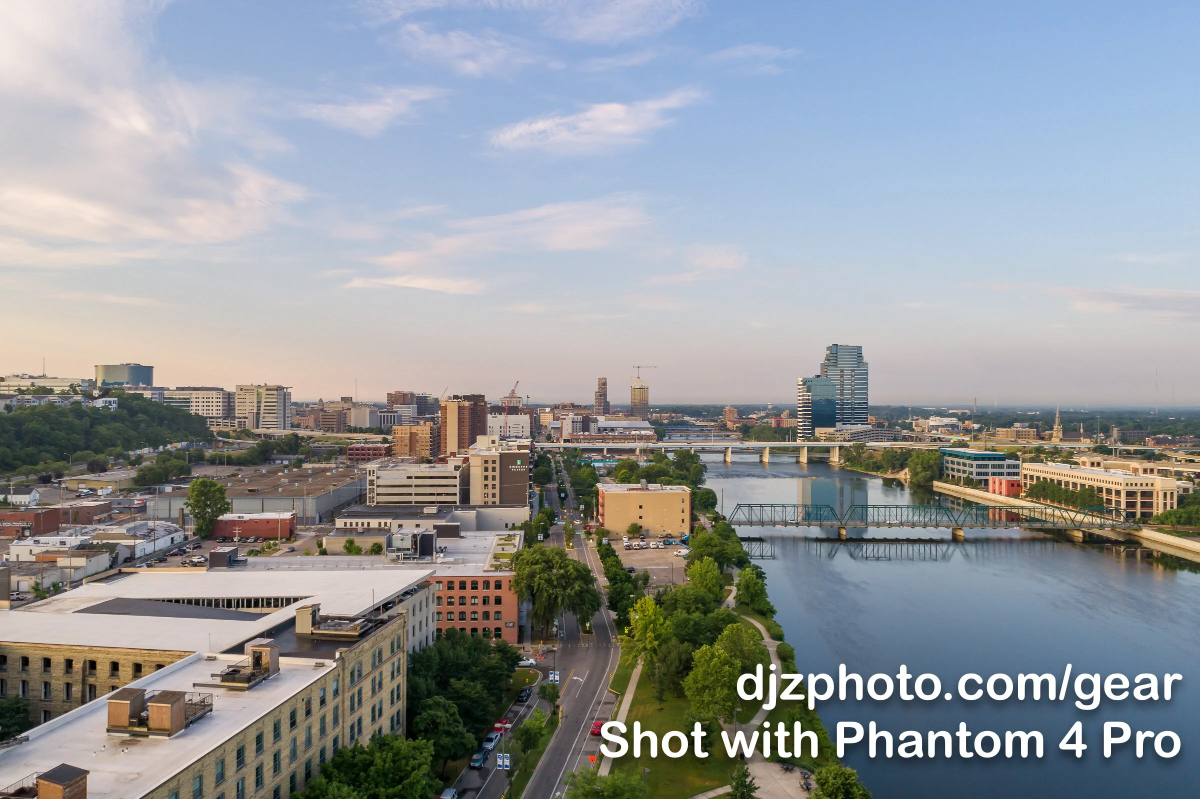
For the next setting I went to a park located north of Grand Rapids, Michigan, and took a shot facing south towards the city. Below are the main shots, which seem similar in quality and would be fine to use in most professional projects:
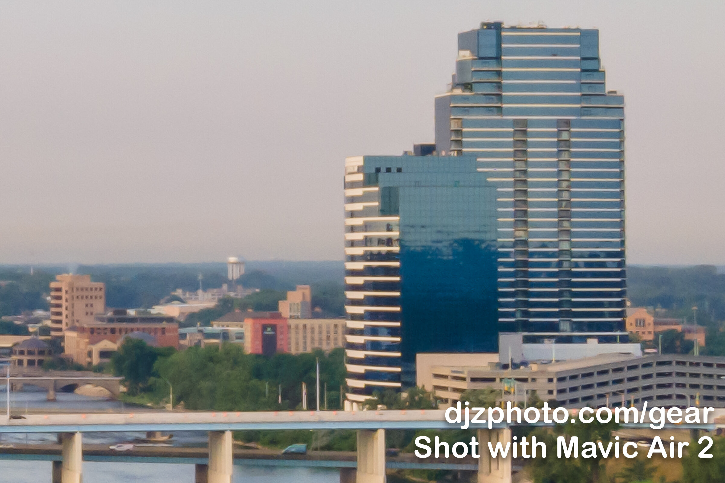
The first crop will be the big building to the right of the river:
The P4P handles the windows and lines on the buildings in this crop much better, with less noise and a more defined & natural look. The buildings and trees in the background are cleaner, sharper, and more defined. The supports under the nearest bridge are also clearer and sharper. Nothing in this crop jumped out at me as looking better on the MA2.
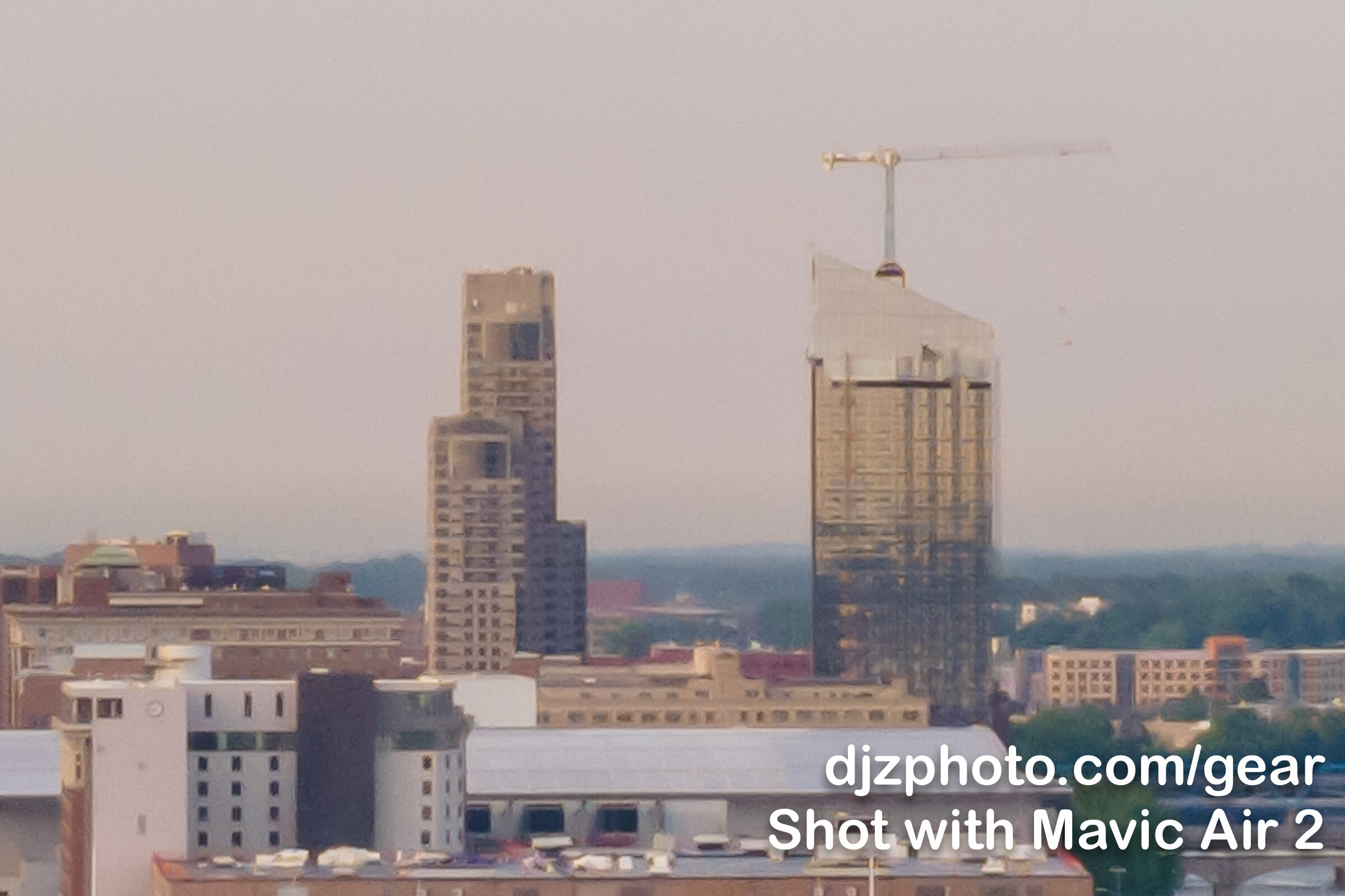
The next crop we can meticulously analyze will be the buildings in the distance to the left of the river:
I will have to give the win to the Phantom 4 Pro! Cleaner, sharper, more defined, more natural looking.
The MA2 does seem to have more sharpness and definition in the construction crane on top of the building though.
The last crop of the city photos will be some of the closer buildings to the left of the river:
In the above crops it seems like the MA2 again pulls a little more definition in the construction cranes. In this image I found it a little tougher to declare a winner, but the P4P does do a better job with the lines and windows on buildings. The P4P also better defines the tree line and buildings in the background near the upper right corner.
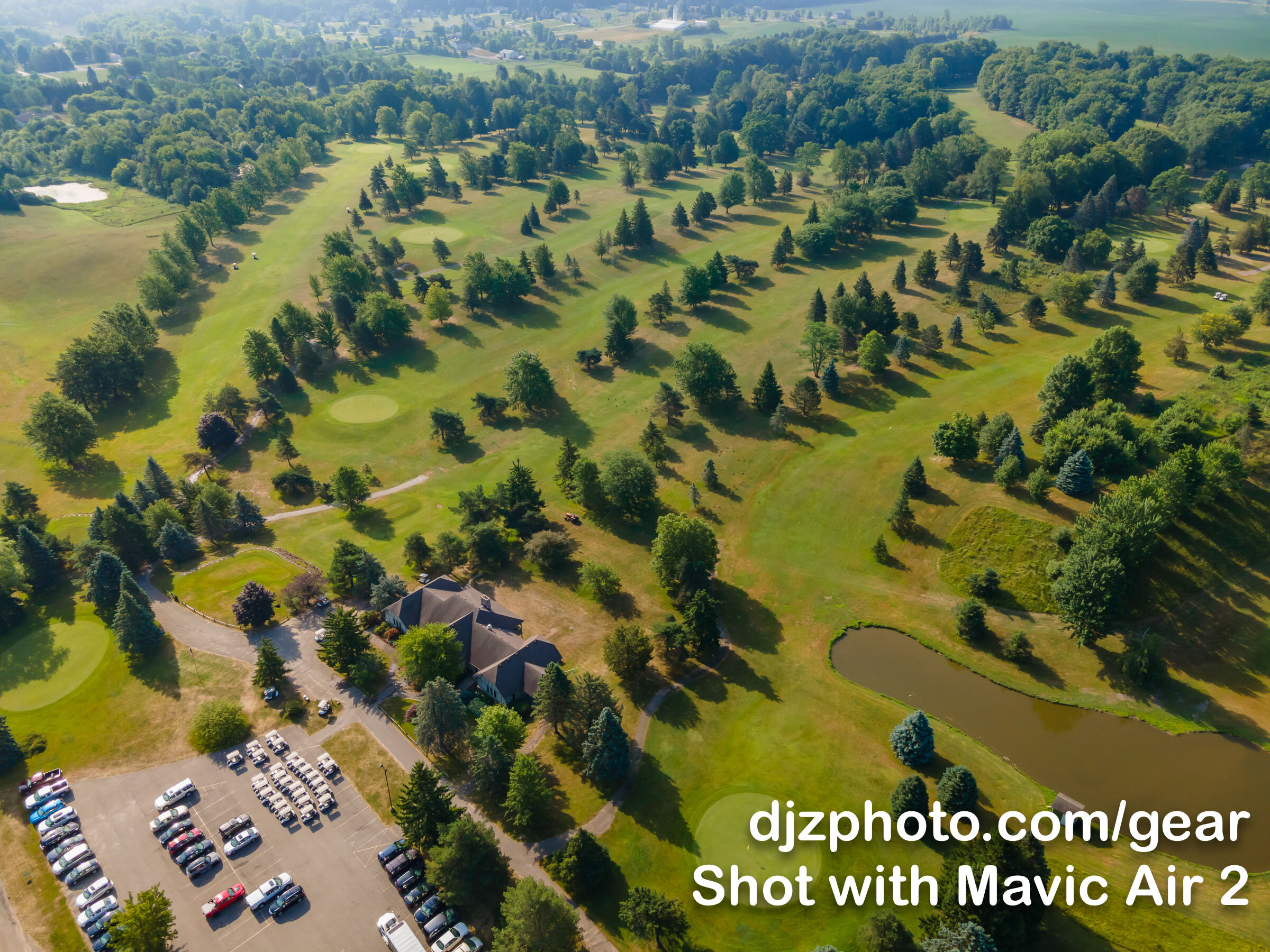
For the final photo location, I took the Phantom 4 Pro and the Mavic Air 2 to a golf course on a hot, hazy summer morning:
The first crop will show the area directly in front of the clubhouse:
In the above crop, the MA2 seems to pull more definition if you look at the roofs on the golf carts. But if you look at the shadow of the big tree in the upper left corner, there is a lot more noise in the MA2 image. Also, the P4P continues to handle the appearance of tree leaves much better (especially the tree on the right).
Next, we’ll zoom in to the shed by the little pond:
If you look at the door on the shed and the shingles on the roof, the P4P shows less noise and more definition, contributing to a more natural look. The water is less noisy on the P4P photo, and… this is the last time I will need to say it… but the leaves and grass on the P4P are more defined.
In the last comparison crop, we’ll take a look at the cars in the parking lot. This was a useful crop because it shows a big difference between the two cameras:
Look at all the sun glares on the cars in the MA2’s photo, and you will see… rampant purple! Look at the same glares in the P4P images, and you see the purple fringing is much more controlled. Wherever you have high contrast bright spots, you will often see purple fringing on the MA2.
I cranked the purple defringe amount to 7 under Adobe Lightroom’s manual lens correction panel, and here is the result:
Lightroom was able to correct the purple fringing for the most part, so that’s good that it’s a fairly easy fix.
Conclusion
I wanted to answer the question, “Are megapixels more important than sensor size?” I think we can answer that question with a “probably not.” In this case, the larger sensor on a 2016 Phantom 4 Pro was able to produce generally better images than a smaller sensor from 2020, even though the smaller Mavic Air 2 produces images with more than twice as many pixels. The P4P’s images were cleaner and handled trees, water, and buildings with more clarity & detail.
(I use the phrase “probably not” because the Mavic Air 2 from 2020 would beat a 6 megapixel APS-C camera sensor from 2006, but that’s obviously an extreme comparison)
That being said, whether you use a Phantom 4 Pro, Mavic 2 Pro, or Mavic Air 2, you have a more than capable drone that can capture quality photos & video for a variety of projects in a variety of environments. It will be hard to tell the difference between an image produced on a Mavic Air 2 and a Phantom 4 Pro (other than the aspect ratio) when you’re looking at the entire image. Whether you’re shooting aerial photos for real estate, landscape photography, or for fun, any of these drones are great options! So here are some additional thoughts I have on the Mavic Air 2 that may help you decide if it’s right for you.
Mavic Air 2 Pros
Super compact, easily fits in a camera bag or carry-on bag
Propellers fold in for transportation without detaching them
Relatively quiet and unobtrusive (especially compared with a Phantom 4 Pro)
Costs half as much as a Phantom 4 Pro or Mavic 2 Pro
Super simple remote app for beginners
Produces great images for most purposes
Only with extreme cropping & zooming will you notice a benefit with the larger, more expensive drones
Mavic Air 2 Cons
Bigger & more expensive drones produce moderately better images that may be helpful for larger prints
I feel like it is more likely to be attacked by or accidentally collide with birds than a larger, louder drone (fortunately I haven’t personally confirmed this)
Remote app and camera options might feel too limited and minimal for professionals (you have to use “DJI Fly,” not the “DJI Go” app)
If you want burst shooting or Automatic Exposure Bracketing (AEB), you have to shoot at 12 megapixels, not 48
2021 Update: DJI has now released the DJI Air 2S (also known as the Mavic Air 2S) which is a MUCH better drone than the Mavic Air 2. See my other article that tests the image quality of the DJI Air 2S vs. the Phantom 4 Pro.
Hopefully this article has been helpful. If you want to support more articles like this, feel free to use any link on this page if you make a purchase. Thanks!
Side Note: This test is also relevant when considering how modern day smartphones are starting to have huge megapixel numbers that are higher than the megapixel numbers of large full-frame cameras. Does that mean that smartphones are as good as full-frame cameras?? The answer is “probably not,” because full frame cameras have much larger sensors.
Products Mentioned in this Article on Amazon
Canon 16-35mm f/4L IS vs. Canon 16-35 f/2.8L III - Which Lens is Sharper?
My philosophy for landscape photography (though I do love tilt shift lenses for architecture) is to get a small number of fast, sharp zoom lenses so I can cover any focal length I need without carrying a bunch of different prime lenses. That will save space in my camera bag and allow me to spend more time taking photos and less time changing lenses. The question I had was: Is the Canon 16-35mm f/2.8L III able to capture sharp photos without comatic aberration, and provide fast wide-angle coverage?
This page contains links to products, so if you find this site useful and use a link to make a purchase, I’ll get a small commission. As an Amazon Associate I earn from qualifying purchases. Thanks!
I have been using the Canon 16-35mm f/4L IS for a few years now, and it has been a reliable workhorse. Most reviewers consider it to be sharper than the Canon 16-35mm f/2.8L II, and it’s smaller and cheaper, so I never gave consideration to the bigger, faster, more expensive lens. The f/4 lens with image stabilization produces nice images, and I found it to be a worthwhile upgrade from the less expensive Canon 17-40mm f/4L I was using previously.
Lately, however, I have started to daydream (night dream?) about astrophotography and nighttime photography. Taking pictures of stars at night? Milky Way? Auroras? Yes please!
The problem with taking pictures at night is that it’s… at night. It’s really dark out. This means you might want a lens with a faster aperture than f/4 to minimize noise. The other potential issue with photographing the starry sky is something called “comatic aberration.” Camera lenses can suffer from varying degrees of comatic aberration, or “coma,” which causes stars to appear misshapen in your photos instead of round, especially at the edges of the frame. Lens aperture, sharpness, and the possibility of comatic aberration are all considerations when looking at lenses for night photography.
The philosophy of some photographers is to get multiple prime lenses at various focal lengths. A good prime lens can be small, fast, and sharp, but only at a single focal length (24mm, for example). With prime lenses, the manufacturer doesn’t have to make compromises to accommodate multiple focal lengths like they do with a zoom lens. The downside to prime lenses is that in order to cover multiple focal lengths, you have to carry multiple lenses.
My philosophy for landscape photography (though I do love tilt shift lenses for architecture) is to get a small number of fast, sharp zoom lenses so I can cover any focal length I need without carrying a bunch of different prime lenses. That will save space in my camera bag and allow me to spend more time taking photos and less time changing lenses. The question I had was: Is the Canon 16-35mm f/2.8L III able to capture sharp photos without comatic aberration, and provide fast wide-angle coverage?
When researching Canon’s 16-35mm f/2.8L III there were multiple websites where I encountered statements like “Canon’s 16-35 f/2.8 III is the same as the f/4 version, except bigger and more expensive, so most people should just get the f/4.” I also saw other research that claimed the new f/2.8 III was sharper, but I couldn’t find image any comparisons of the two lenses for the purpose of astrophotography, so naturally, I had to check it out for myself.
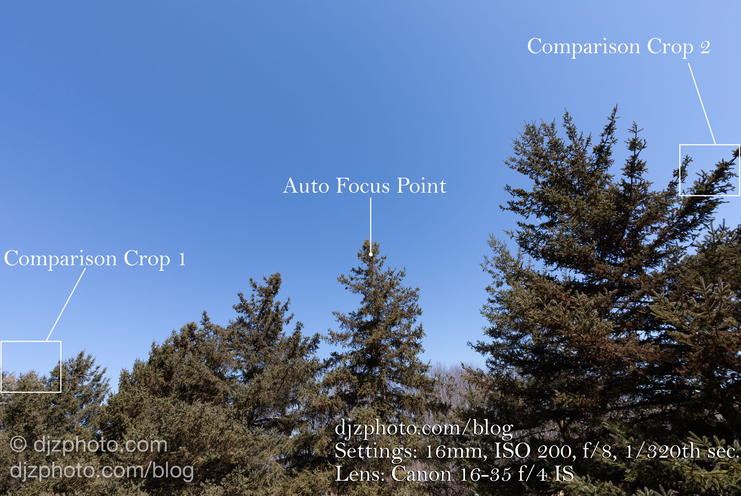
First, I wanted to compare the lenses for standard daytime photography at the wide end (16mm), where most lenses reveal the most distortion. I setup a tripod and took a picture of the same trees from the same spot, with the same settings for the two lenses: Canon 5D Mark IV, 16mm, ISO 200, f/8, 1/320th shutter.
Before I continue, please realize that I am going to be zooming in over 1000% in order to notice slight differences. Both lenses can certainly produce images that are print quality, without question. I just wanted to dig out the pixels to an extreme degree to see if one lens is slightly better than the other.
First, let’s look at the daytime shots.
Here we see two 16mm shots from the two lenses. Settings: 16mm, ISO 200, f/8, 1/320th sec.
Overall, it looks like two standard, sharp daytime shots. In these images I have labeled the areas that I’ll be zooming in to (Auto Focus Point, Comparison Crop 1, and Comparison Crop 2).
Most people wouldn’t notice a difference in sharpness in the above two images.
Next, let’s zoom in to the center of the image, where I pointed both lenses at the top of a tree to autofocus.
Nothing substantial yet, still just looks like two sharp daytime photos at the center of the image. Still pretty difficult to see any difference between the two.
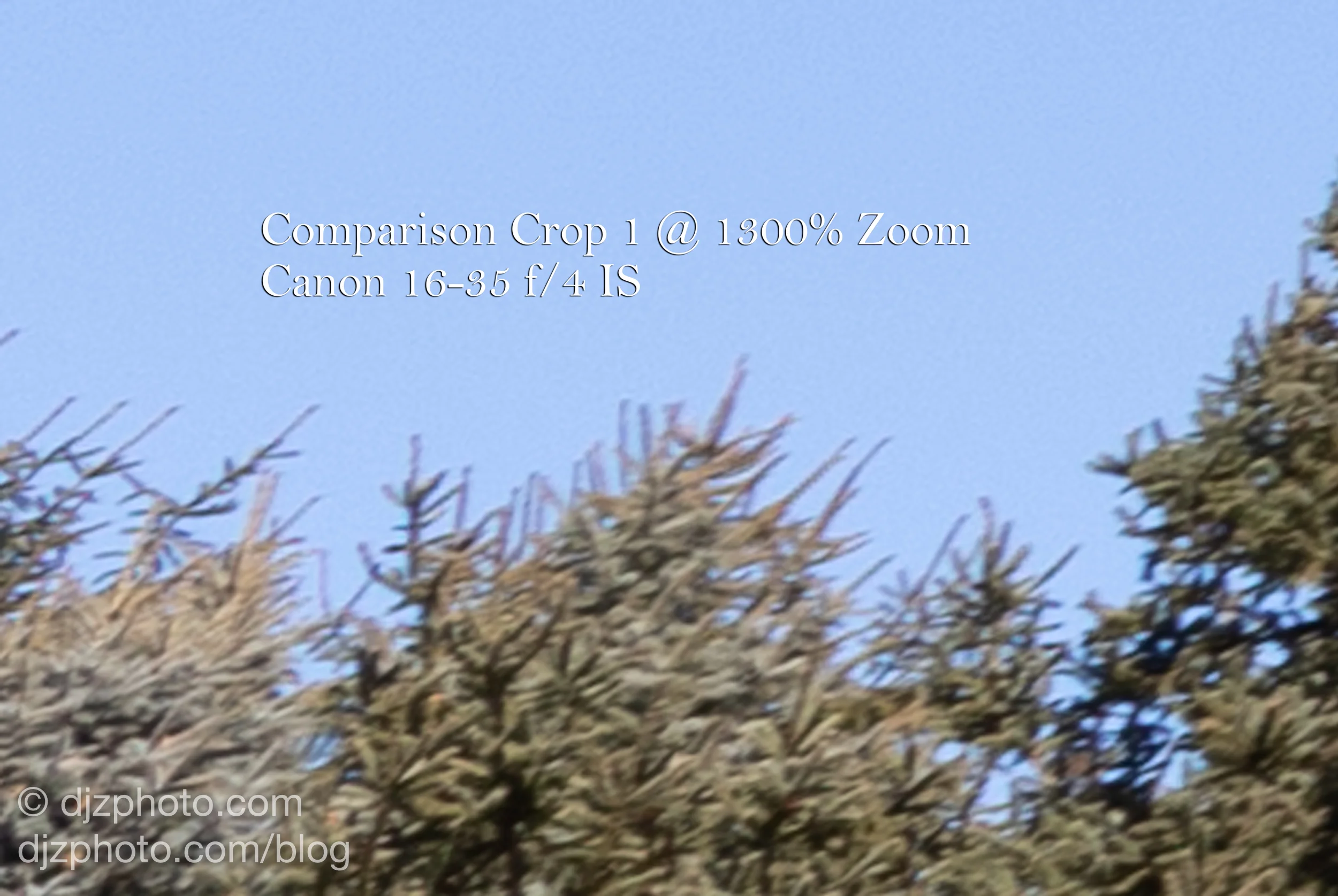
Next, let’s take a look at where lots of lenses tend to reveal their weaknesses… the edges. We can start with Crop area 1 on the left side of the frame.
I was surprised at how sharp the f/2.8L III lens was at the edges in crop area 1 compared to the f/4L! I wasn’t sure if there would be much difference, but the clear winner here was the f/2.8 III, hands down. Again let me reiterate that most people would not notice this if you were looking at the whole image, it’s only when we zoom in to 1300% that these differences become apparent near the edge of the frame.
Next, let’s take a look at crop area 2 on the right side of the frame.
In crop area 2 the f/2.8L III still wins but perhaps less dramatically. It’s most noticeable if you look at the needles on the right side.
Next, let’s take our lenses to a slightly more challenging environment: photographing stars at night.
First, we have the whole scene comparison shots. I added in constellations for reference, and for fun (because why not?). It’s worth noting that the f/2.8 III has an obvious advantage in that it can open up to f/2.8 and capture light twice as fast as the f/4L lens, so to keep it fair, I set both lenses to f/4 and auto focused on some of the house lights across the water.
Settings: Canon 5D Mark IV, 16mm, ISO 3200, f/4, 10 second exposures (stacked in Starry Landscape Stacker to reduce noise)
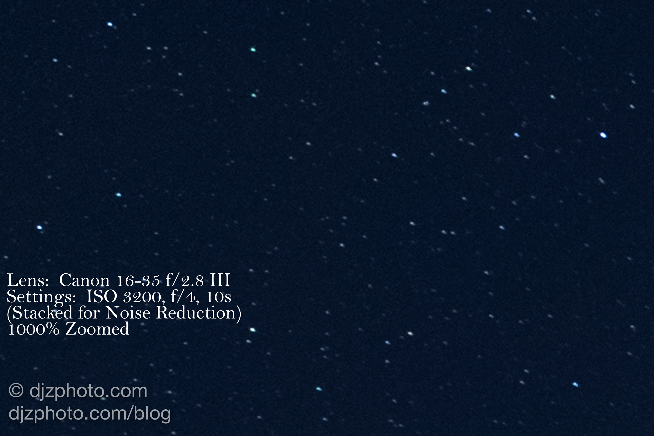
In those whole scene comparisons you wouldn’t notice any difference between lenses. So let’s zoom in to about 1000% at the center, above the constellation Serpens Caput.
I didn’t see much of a difference at the center, especially considering this is a tiny section of a 30-megapixel image. Next, let’s zoom in to the edges and see what happens. We can start near the feet of the constellation Hercules.
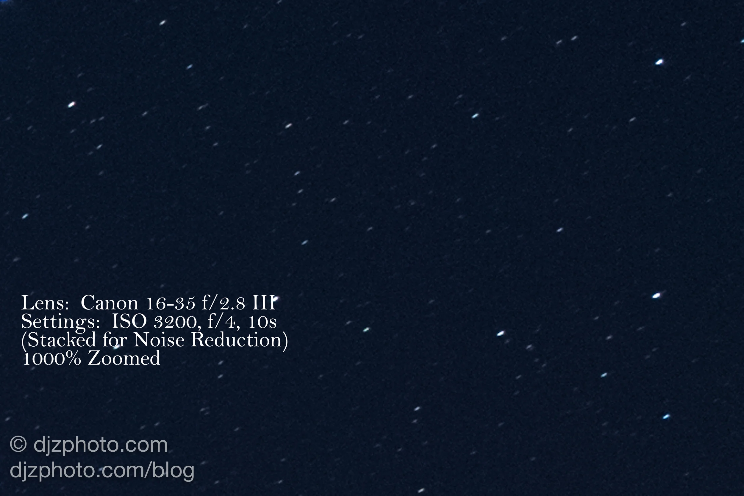
In the above images we can see a slight example of “coma” (comatic aberration) in the f/4 image now that we’ve zoomed in to an extreme degree near the left side of the overall image, near Hercules’ feet. Even though you wouldn’t see it when looking at the whole picture, when we look closely we can see the the stars in the f/4 lens image seem to be shaped like little paper airplanes that are leaking pixels, instead of round stars as they should be. The stars in the image produced with the f/2.8L III lens (set to f/4 to make the comparison even) are rounder and sharper. Since it is a 10 second exposure and we are zoomed in over 1000%, the star movement is slightly apparent, but I was pleased with how sharp the stars were on the f/2.8 III, and happy that it exhibited virtually no coma.
Let’s check the right side of the image near the constellation Virgo.
On the right side of the frame, near the constellation Virgo, the f/2.8L III lens is again the winner. The stars are sharp, round points that have moved slightly over the course of 10 seconds, but the f/4’s stars are slightly blurry from edge softness and shaped like little bats due to the minor comatic aberration going on.
While these slight differences are probably not noticeable to someone looking at the whole image, it is good to know that Canon clearly put a lot of effort into making the 16-35mm f/2.8L III lens optically superior to all of it’s previous 16-35mm offerings, with edge to edge sharpness and virtually no comatic aberration. This is reassuring if you are looking to make large prints of your photos, and a high quality lens with exceptional sharpness will be more able to support a higher megapixel camera in the future. In 2004, Canon’s EOS-1D Mark II was 8 megapixels, and the EOS-1D was only 4 megapixels in 2001! Camera companies in the not-so-distant past were making full-frame lenses for cameras that were either 35mm film or low-megapixel digital. But now that 20, 30, and 50 megapixel camera bodies are standard and meticulous people (like me!) are analyzing lens sharpness at 1300% zoom levels, lenses have to be able to support all those megapixels with high quality optics. What’s the point of all those megapixels if the lens isn’t sharp?
Hopefully you found this helpful in comparing a couple of Canon’s wide angle zoom offerings. I learned a little bit while making this comparison page, and that’s always a good thing. =)


